









New Publication: Affective color scales for colormap data visualizations

Our paper, “Affective color scales for colormap data visualizations,” was published in IEEE Transactions on Visualization and Computer Graphics.

AUthors: Halle c. braun, kushin mukherjee, seth r. gorelik, & Karen b. Schloss

Research on affective visualization design has shown that color is an especially powerful feature for influencing the emotional connotation of visualizations. Associations between colors and emotions are largely driven by lightness (e.g., lighter colors are associated with positive emotions, whereas darker colors are associated with negative emotions). Designing visualizations to have all light or all dark colors to convey particular emotions may work well for visualizations in which colors represent categories and spatial channels encode data values. However, this approach poses a problem for visualizations that use color to represent spatial patterns in data (e.g., colormap data visualizations) because lightness contrast is needed to reveal fine details in spatial structure. In this study, we found it is possible to design colormaps that have strong lightness contrast to support spatial vision while communicating clear affective connotation. We also found that affective connotation depended not only on the color scales used to construct the colormaps, but also the frequency with which colors appeared in the map, as determined by the underlying dataset (data-dependence hypothesis). These
results emphasize the importance of data-aware design, which accounts for not only the design features that encode data (e.g., colors, shapes, textures), but also how those design features are instantiated in a visualization, given the properties of the data.

Reference: Braun, H. C., Mukherjee, K., Gorelik, S. R., & Schloss, K. B (2026). Affective color scales for colormap data visualizations. IEEE Transactions on Visualization and Computer Graphics, 32, 1, 692-702. Honorable mention for Best Paper at IEEE VIS 2025. PDF

New Publication: Texture semantics is robust to scaling

Our paper, “Texture semantics is robust to scaling,” was published in 2025 IEEE Visualization and Visual Analytics (VIS).

AUthors: Zoe S. Howard and Karen B. Schloss

Studies of visual semantics for information visualization aim to understand observers’ expectations about the meaning of visual features (e.g., color, texture) because visualizations that align with those expectations are easier to interpret. Previous work on visual semantics focused primarily on color, with the implicit assumption that color semantics is unaffected by changes in the size of the visualization (given sufficient perceptual discriminability across sizes). Changing size from small scale (e.g., small figures in a paper) to large scale (e.g., large figures in a slide presentation) is straightforward for visualizations that have solid colored regions, but can be more complicated for visualizations with heterogeneous textures because there are multiple ways to scale textures—zooming or repeating texture elements. Previous work suggested that original textures were more perceptually similar to repeat-scaled rather than zoom-scaled textures. Here, we found that texture semantics was preserved after both types of enlargement, suggesting that texture semantics is robust to scaling, at least for geometric textures in which elements are visible at all scales.

Reference: Howard, Z. S. & Schloss, K. B. (2025). Texture semantics is robust to scaling. 2025 IEEE Visualization and Visual Analytics (VIS). PDF

New Publication: Color semantics in human cognition

New paper “Color semantics in human cognition,” was published in Current Directions in Psychological Science.

AUthor: Karen B. Schloss


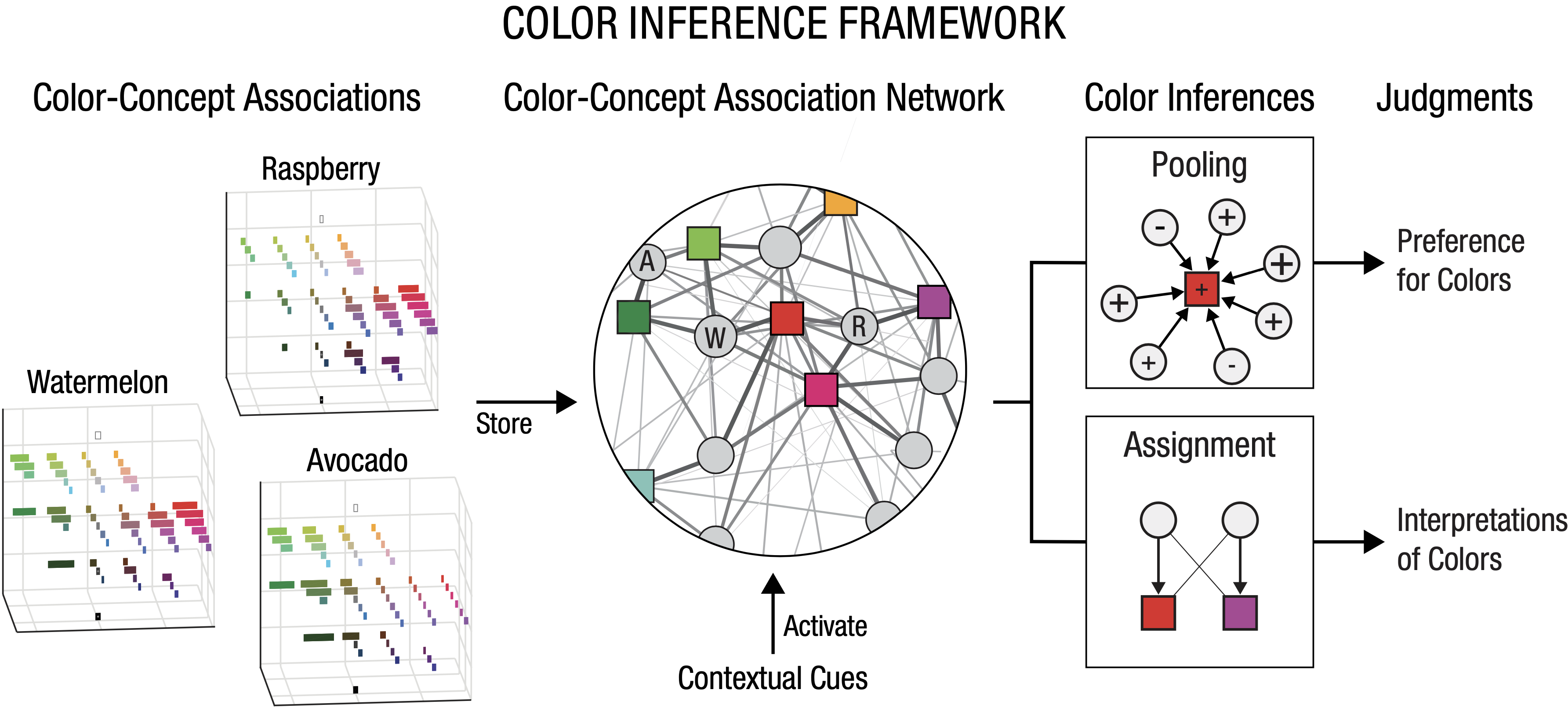
People have associations between colors and concepts that influence the way they interpret color meaning in information visualizations (e.g., charts, maps, diagrams). These associations are not limited to concrete objects (e.g., fruits, vegetables); even abstract concepts, like sleeping and driving, have systematic color-concept associations. However, color-concept associations and color meaning (color semantics) are not the same thing, and sometimes they conflict. This article describes an approach to understanding color semantics called the color inference framework. The framework shows how color semantics is highly flexible and context dependent, which makes color an effective medium for communication.

Reference: Schloss, K. B. (2024). Color semantics in human cognition. Current Directions in Psychological Science, 33, 1, 58-67. PDF


Dr. Melissa Schoenlein defended her dissertation!

Dr. Melissa Schoenlein defended her dissertation on Effects of color category structure on learning and generalization of color-concept associations for novel concepts. Now, Melissa is off to start a faculty position in Psychology at High Point University!

Congratulations Melissa! We are so incredibly proud of you and excited for you to start this next exciting step in your career!

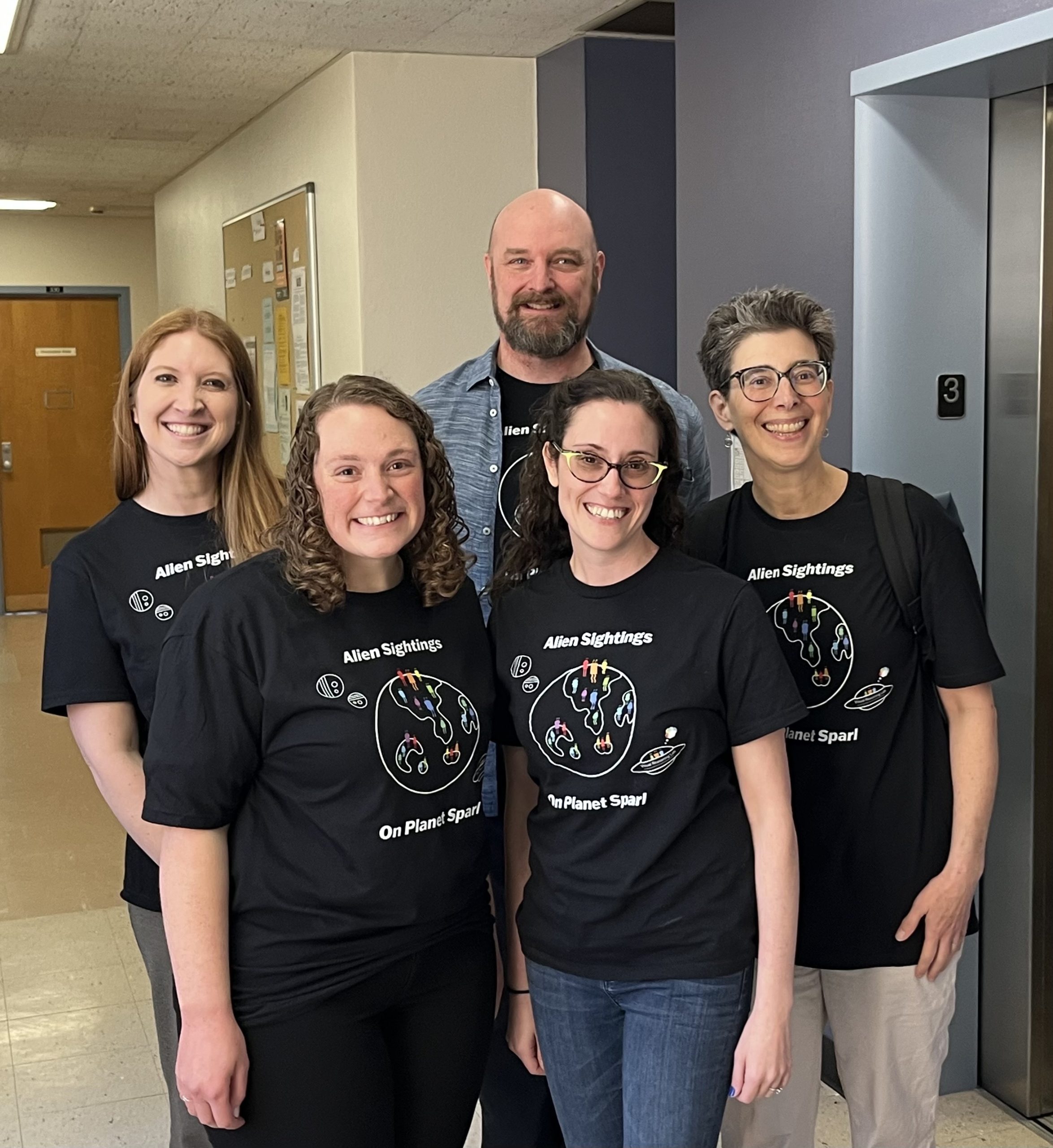
Photo: Melissa Schoenlein and PhD Advisor Karen Schloss (front row); Dissertation Committee Members Haley Vlach, Tim Rogers, Jenny Saffran (back row)


Melissa Schoenlein was awarded a 2023-2024 UW-Madison Capstone Teaching Award

Melissa Schoenlein was awarded a 2023-2024 UW-Madison Capstone Teaching Award for her course Psychology of Information Visualization (Spring 2023)! This award recognizes dissertators at the end of their graduate program with an outstanding teaching record over the course of their UW–Madison tenure.

Melissa’s students especially appreciated how she facilitated discussion in an open, inclusive class environment.  One student wrote, “Melissa’s passion for the material was salient. Yet, even when it was clear that she could go on about a topic for hours, she stepped back and let us drive the conversation with her guidance.” Another student commented, “Melissa did a great job of creating a space where people wanted to share their thoughts and opinions. There were rarely pauses because everyone actively wanted to share commentary.” Congratulations Melissa!

Graduate admissions for Fall 2024

Professor Karen Schloss will consider new graduate students for admission for Fall 2024. Prospective PhD students are encouraged to apply to the UW-Madison Psychology PhD program. Please click here for information about our program and how to apply. We look forward to reviewing your applications!

New Publication: More of what? Dissociating effects of conceptual and numeric mappings on interpreting colormap data visualizations

Our paper, “More of what? Dissociating effects of conceptual and numeric mappings on interpreting colormap data visualizations,” was published in Cognitive Research: Principles and Implications.

AUthors: LEXI SOTO,  MELISSA A. SCHOENLEIN, and Karen B. Schloss

In visual communication, people glean insights about patterns of data by observing visual representations of datasets. Colormap data visualizations (“colormaps”) show patterns in datasets by mapping variations in color to variations in magnitude. When people interpret colormaps, they have expectations about how colors map to magnitude, and they are better at interpreting visualizations that align with those expectations. For example, they infer that darker colors map to larger quantities (dark-is-more bias) and colors that are higher on vertically oriented legends map to larger quantities (high-is-more bias). In previous studies, the notion of quantity was straightforward because more of the concept represented (conceptual magnitude) corresponded to larger numeric values (numeric magnitude). However, conceptual and numeric magnitude can conflict, such as using rank order to quantify health—smaller numbers correspond to greater health. Under conflicts, are inferred mappings formed based on the numeric level, the conceptual level, or a combination of both? We addressed this question across five experiments, spanning data domains: alien animals, antibiotic discovery, and public health. Across experiments, the high-is-more bias operated at the conceptual level: colormaps were easier to interpret when larger conceptual magnitude was represented higher on the legend, regardless of numeric magnitude. The dark-is-more bias tended to operate at the conceptual level, but numeric magnitude could interfere, or even dominate, if conceptual magnitude was less salient. These results elucidate factors influencing meanings inferred from visual features and emphasize the need to consider data meaning, not just numbers, when designing visualizations aimed to facilitate visual communication.

Reference: Soto, L., Schoenlein, M. A., & Schloss, K. B. (2023). More of what? Dissociating effects of conceptual and numeric mappings on interpreting colormap data visualizations. Cognitive Research: Principles and Implications, 8, 38, 1-17. PDF


Melina Mueller Awarded a Hilldale Undergraduate/Faculty Research Fellowship

Melina Mueller headshotCongratulations to Melina Mueller for receiving a Hilldale Undergraduate/Faculty Research Fellowship, which provides research training and support for undergraduates to undertake their own research project in collaboration with UW–Madison faculty or research/instructional academic staff. This award will support Melina’s honors thesis project investigating the effects of verbal interference on color category extrapolation for learning novel color-concept associations (advised by PI Karen Schloss and graduate student Melissa Schoenlein).