
Our paper, “Large Language Models Estimate Fine-Grained Human Color–Concept Associations,” was published in Cognitive Science.
AUthors: Kushin Mukherjee, Ankit Mohapatra, Timothy T. Rogers, & Karen b. Schloss
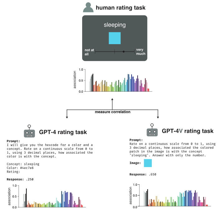 People reliably associate the meanings of both abstract and concrete words with colors distributed over color space, a phenomenon that influences aspects of visual cognition ranging from object recognition to interpreting information visualizations. Prior research has hypothesized that color–concept associations arise from the cross-modal statistical structure of experience, but it remains unclear whether natural environments contain such structure or whether learning systems can discover it without strong prior constraints. To address these questions, we investigated whether GPT-4, a multimodal large language model, can estimate color–concept association ratings that approximate those made by people. We tested 71 colors spanning perceptual color space and a variety of concepts varying in abstractness. GPT-4 ratings correlated strongly with human ratings across a range of prompting strategies, outperforming prior state-of-the-art methods for automatically estimating color–concept associations from images. In an empirical study assessing people’s ability to interpret the meanings of colors in information visualizations, palettes generated from GPT-4’s rating data were not only interpretable but, in some cases, more effective than those based on human ratings. Taken together, our results suggest that high-order covariance between language and perception, present in web-scale data, provide sufficient information to learn color–concept associations without initial constraints, and that machine-derived associations can support the optimization of information visualizations for visual communication.
Reference: Mukherjee, K., Mohapatra, A., Rogers, T. T., & Schloss, K. B. (2026). Large language models estimate fine-grained human color-concept associations. Cognitive Science, 50, 6, e70219. PDF


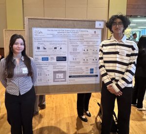
 Congratulations to Ashwini Kumble (third from the right) and Sophia Wang (third from the left) for receiving an Outstanding Undergraduate Research Scholar (OURS) Award. This award recognizes outstanding undergraduate Psychology majors for their contribution to research in our department. We thank Ashwini and Sophia for their outstanding work in our lab!
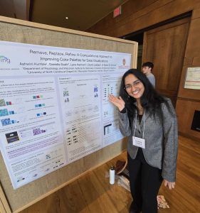
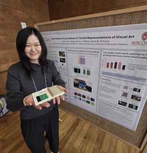
 Students from the Schloss Visual Reasoning Lab presented their work at the 29th annual Undergraduate Symposium! The annual Undergraduate Research Symposium showcases undergraduate research, scholarly work, community-based projects, art, and creativity from all areas of study at UW–Madison.
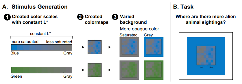 When interpreting data visualizations, people have expectations of how colors should map onto quantities. These expectations are constructed from multiple biases, including the dark-is-more bias (darker colors represent larger quantities) and the opaque-is-more bias (regions appearing more opaque represent larger quantities), among others. The extent to which any one bias influences interpretations of data visualizations depends on the degree to which that bias is applicable for a given visualization (applicability principle) and its relative weight in combination with other biases (combination principle). However, basic questions remain concerning the perceptual conditions necessary to activate such biases so they become applicable. For example, in previous studies of the opaque-is-more bias, the test stimuli appeared to vary in opacity because they were created by interpolating between a “base” color and a background color, which was lighter or darker than the base color. As such, opacity variation was confounded with large lightness variation. From prior work, it is unknown whether the opaque-is-more bias can be activated without substantial lightness variation. Here, we varied opacity by varying colormap saturation relative to the background while reducing lightness contrast (holding L* in CIELAB constant). We found that the opaque-is-more bias can indeed be activated without substantial lightness variation. In the process, we also found evidence for a new, “saturated-is-more bias,” leading to expectations that regions greater in saturation map to larger magnitudes. These findings extend knowledge of how people infer meaning from visual features and can translate to inform design of effective information visualizations.
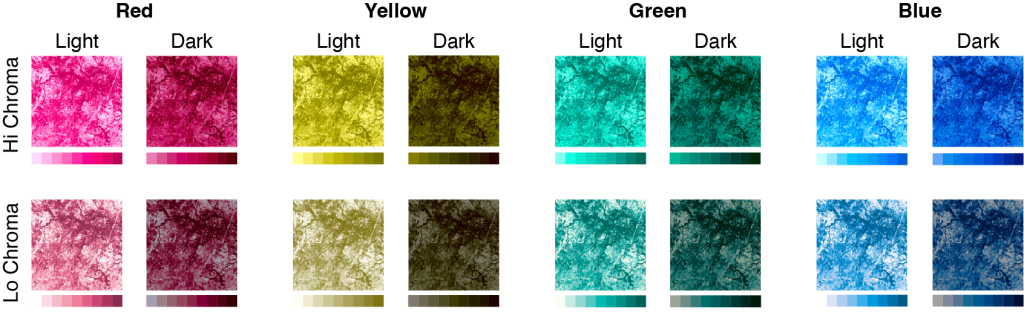 Research on affective visualization design has shown that color is an especially powerful feature for influencing the emotional connotation of visualizations. Associations between colors and emotions are largely driven by lightness (e.g., lighter colors are associated with positive emotions, whereas darker colors are associated with negative emotions). Designing visualizations to have all light or all dark colors to convey particular emotions may work well for visualizations in which colors represent categories and spatial channels encode data values. However, this approach poses a problem for visualizations that use color to represent spatial patterns in data (e.g., colormap data visualizations) because lightness contrast is needed to reveal fine details in spatial structure. In this study, we found it is possible to design colormaps that have strong lightness contrast to support spatial vision while communicating clear affective connotation. We also found that affective connotation depended not only on the color scales used to construct the colormaps, but also the frequency with which colors appeared in the map, as determined by the underlying dataset (data-dependence hypothesis). These