Our paper, “Red and blue states: dichotomized maps mislead and reduce perceived voting influence,” was published in Cognitive Research: Principles and Implications.
AUthors: Rémy A. Furrur, Karen B. Schloss, Gary Lupyan, Paula M. Neidenthal, and Adrienne Wood
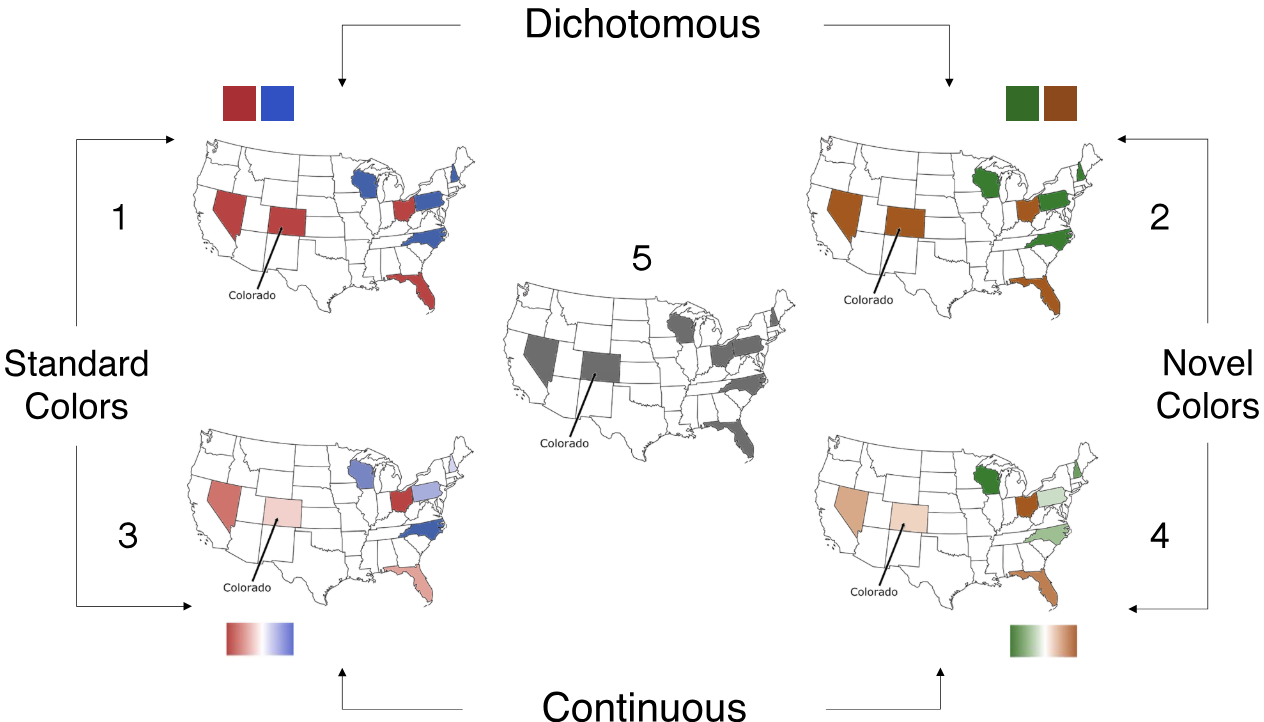 In the United States the color red has come to represent the Republican party, and blue the Democratic party, in maps of voting patterns. Here we test the hypothesis that voting maps dichotomized into red and blue states leads people to overestimate political polarization compared to maps in which states are represented with continuous gradations of color. We also tested whether any polarizing effect is due to partisan semantic associations with red and blue, or if alternative hues produce similar efects. In Study 1, participants estimated the hypothetical voting patterns of eight swing states on maps with dichotomous or continuous red/blue or orange/green color schemes. A continuous gradient mitigated the polarizing efects of red/blue maps on voting predictions. We also found that a novel hue pair, green/orange, decreased perceived polarization. Whether this efect was due to the novelty of the hues or the fact that the hues were not explicitly labeled “Democrat” and “Republican” was unclear. In Study 2, we explicitly assigned green/orange hues to the two parties. Participants viewed electoral maps depicting results from the 2020 presidential election and estimated the voting margins for a subset of states. We replicated the finding that continuous red/blue gradient reduced perceived polarization, but the novel hues did not reduce perceived polarization. Participants also expected their hypothetical vote to matter more when viewing maps with continuous color gradations. We conclude that the dichotomization of electoral maps (not the particular hues) increases perceived voting polarization and reduces a voter’s expected influence on election outcomes.