
Our paper, “Understanding the opaque‑is‑more bias and saturated‑is‑more bias for colormap data visualizations,” was published in Attention, Perception, & Psychophysics.
AUthors: Melissa A. Schoenlein, Mouloukou Sidibe, & Karen b. Schloss
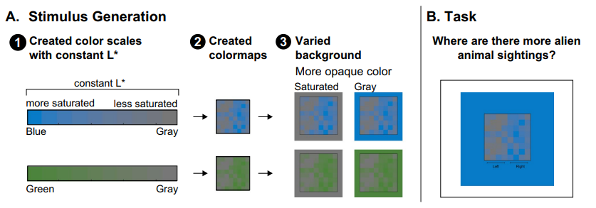 When interpreting data visualizations, people have expectations of how colors should map onto quantities. These expectations are constructed from multiple biases, including the dark-is-more bias (darker colors represent larger quantities) and the opaque-is-more bias (regions appearing more opaque represent larger quantities), among others. The extent to which any one bias influences interpretations of data visualizations depends on the degree to which that bias is applicable for a given visualization (applicability principle) and its relative weight in combination with other biases (combination principle). However, basic questions remain concerning the perceptual conditions necessary to activate such biases so they become applicable. For example, in previous studies of the opaque-is-more bias, the test stimuli appeared to vary in opacity because they were created by interpolating between a “base” color and a background color, which was lighter or darker than the base color. As such, opacity variation was confounded with large lightness variation. From prior work, it is unknown whether the opaque-is-more bias can be activated without substantial lightness variation. Here, we varied opacity by varying colormap saturation relative to the background while reducing lightness contrast (holding L* in CIELAB constant). We found that the opaque-is-more bias can indeed be activated without substantial lightness variation. In the process, we also found evidence for a new, “saturated-is-more bias,” leading to expectations that regions greater in saturation map to larger magnitudes. These findings extend knowledge of how people infer meaning from visual features and can translate to inform design of effective information visualizations.
Reference: Schoenlein, M. A., Sidibe, M., & Schloss, K. B. (2026). Understanding the opaque-is-more bias and saturated-is-more bias for colormap data visualizations. Attention, Perception, & Psychophysics, 88, 3, 69. PDF