
Our paper, “Large Language Models Estimate Fine-Grained Human Color–Concept Associations,” was published in Cognitive Science.
AUthors: Kushin Mukherjee, Ankit Mohapatra, Timothy T. Rogers, & Karen b. Schloss
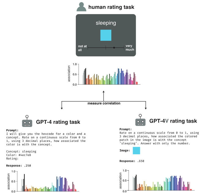 People reliably associate the meanings of both abstract and concrete words with colors distributed over color space, a phenomenon that influences aspects of visual cognition ranging from object recognition to interpreting information visualizations. Prior research has hypothesized that color–concept associations arise from the cross-modal statistical structure of experience, but it remains unclear whether natural environments contain such structure or whether learning systems can discover it without strong prior constraints. To address these questions, we investigated whether GPT-4, a multimodal large language model, can estimate color–concept association ratings that approximate those made by people. We tested 71 colors spanning perceptual color space and a variety of concepts varying in abstractness. GPT-4 ratings correlated strongly with human ratings across a range of prompting strategies, outperforming prior state-of-the-art methods for automatically estimating color–concept associations from images. In an empirical study assessing people’s ability to interpret the meanings of colors in information visualizations, palettes generated from GPT-4’s rating data were not only interpretable but, in some cases, more effective than those based on human ratings. Taken together, our results suggest that high-order covariance between language and perception, present in web-scale data, provide sufficient information to learn color–concept associations without initial constraints, and that machine-derived associations can support the optimization of information visualizations for visual communication.
Reference: Mukherjee, K., Mohapatra, A., Rogers, T. T., & Schloss, K. B. (2026). Large language models estimate fine-grained human color-concept associations. Cognitive Science, 50, 6, e70219. PDF
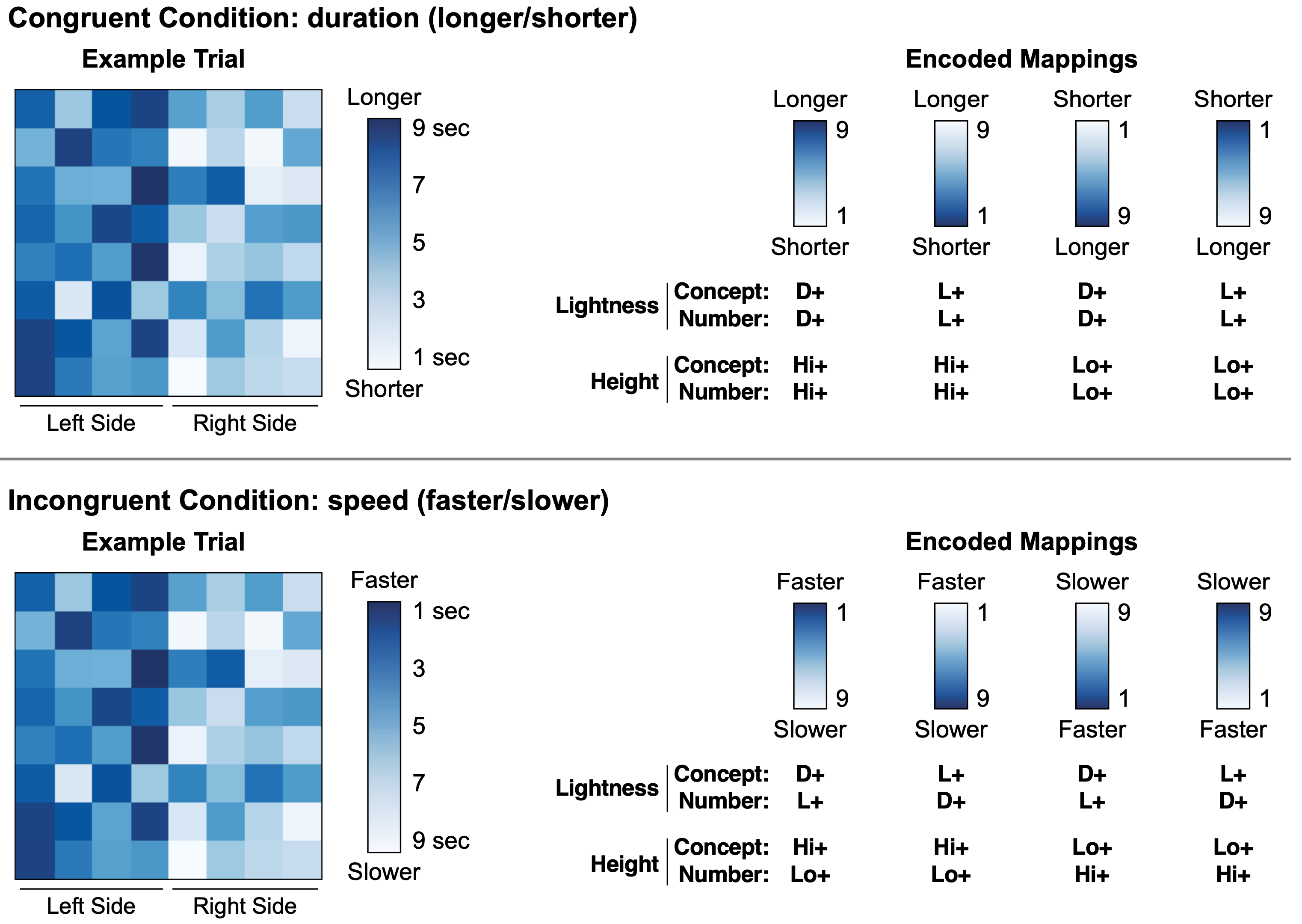
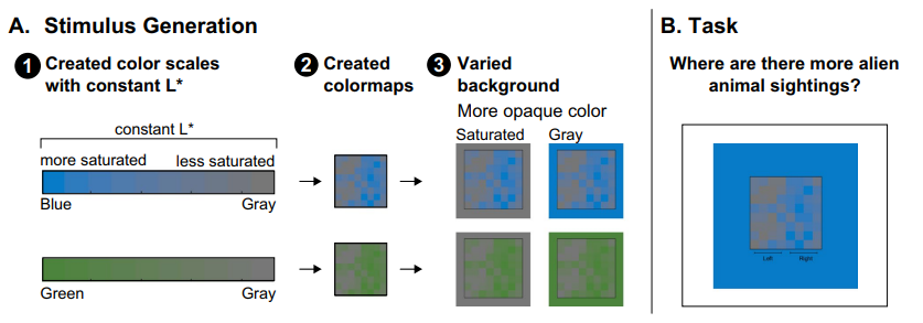 When interpreting data visualizations, people have expectations of how colors should map onto quantities. These expectations are constructed from multiple biases, including the dark-is-more bias (darker colors represent larger quantities) and the opaque-is-more bias (regions appearing more opaque represent larger quantities), among others. The extent to which any one bias influences interpretations of data visualizations depends on the degree to which that bias is applicable for a given visualization (applicability principle) and its relative weight in combination with other biases (combination principle). However, basic questions remain concerning the perceptual conditions necessary to activate such biases so they become applicable. For example, in previous studies of the opaque-is-more bias, the test stimuli appeared to vary in opacity because they were created by interpolating between a “base” color and a background color, which was lighter or darker than the base color. As such, opacity variation was confounded with large lightness variation. From prior work, it is unknown whether the opaque-is-more bias can be activated without substantial lightness variation. Here, we varied opacity by varying colormap saturation relative to the background while reducing lightness contrast (holding L* in CIELAB constant). We found that the opaque-is-more bias can indeed be activated without substantial lightness variation. In the process, we also found evidence for a new, “saturated-is-more bias,” leading to expectations that regions greater in saturation map to larger magnitudes. These findings extend knowledge of how people infer meaning from visual features and can translate to inform design of effective information visualizations.
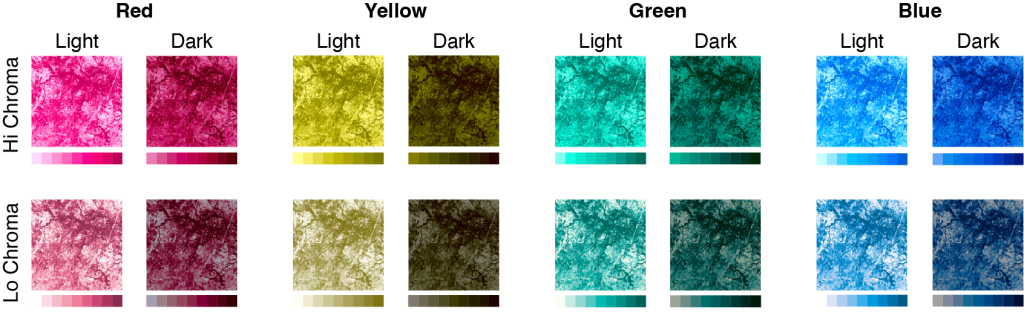 Research on affective visualization design has shown that color is an especially powerful feature for influencing the emotional connotation of visualizations. Associations between colors and emotions are largely driven by lightness (e.g., lighter colors are associated with positive emotions, whereas darker colors are associated with negative emotions). Designing visualizations to have all light or all dark colors to convey particular emotions may work well for visualizations in which colors represent categories and spatial channels encode data values. However, this approach poses a problem for visualizations that use color to represent spatial patterns in data (e.g., colormap data visualizations) because lightness contrast is needed to reveal fine details in spatial structure. In this study, we found it is possible to design colormaps that have strong lightness contrast to support spatial vision while communicating clear affective connotation. We also found that affective connotation depended not only on the color scales used to construct the colormaps, but also the frequency with which colors appeared in the map, as determined by the underlying dataset (data-dependence hypothesis). These
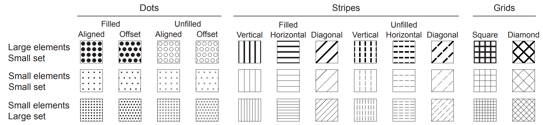 Studies of visual semantics for information visualization aim to understand observers’ expectations about the meaning of visual features (e.g., color, texture) because visualizations that align with those expectations are easier to interpret. Previous work on visual semantics focused primarily on color, with the implicit assumption that color semantics is unaffected by changes in the size of the visualization (given sufficient perceptual discriminability across sizes). Changing size from small scale (e.g., small figures in a paper) to large scale (e.g., large figures in a slide presentation) is straightforward for visualizations that have solid colored regions, but can be more complicated for visualizations with heterogeneous textures because there are multiple ways to scale textures—zooming or repeating texture elements. Previous work suggested that original textures were more perceptually similar to repeat-scaled rather than zoom-scaled textures. Here, we found that texture semantics was preserved after both types of enlargement, suggesting that texture semantics is robust to scaling, at least for geometric textures in which elements are visible at all scales.
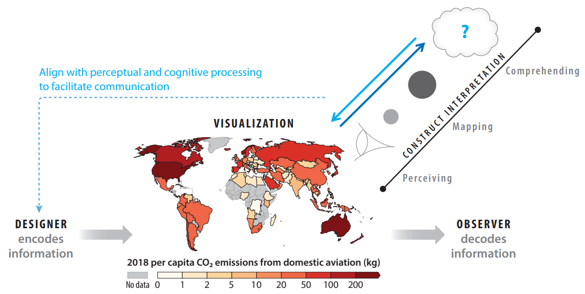 Information visualization is central to how humans communicate. Designers produce visualizations to represent information about the world, and observers construct interpretations based on the visual input as well as their heuristics, biases, prior knowledge, and beliefs. Several layers of processing go into the design and interpretation of visualizations. This review focuses on processes that observers use for interpretation: perceiving visual features and their interrelations, mapping those visual features onto the concepts they represent, and comprehending information about the world based on observations from visualizations. Observers are more effective at interpreting visualizations when the design is well-aligned with the way their perceptual and cognitive systems naturally construct interpretations. By understanding how these systems work, it is possible to design visualizations that play to their strengths and thereby facilitate visual communication.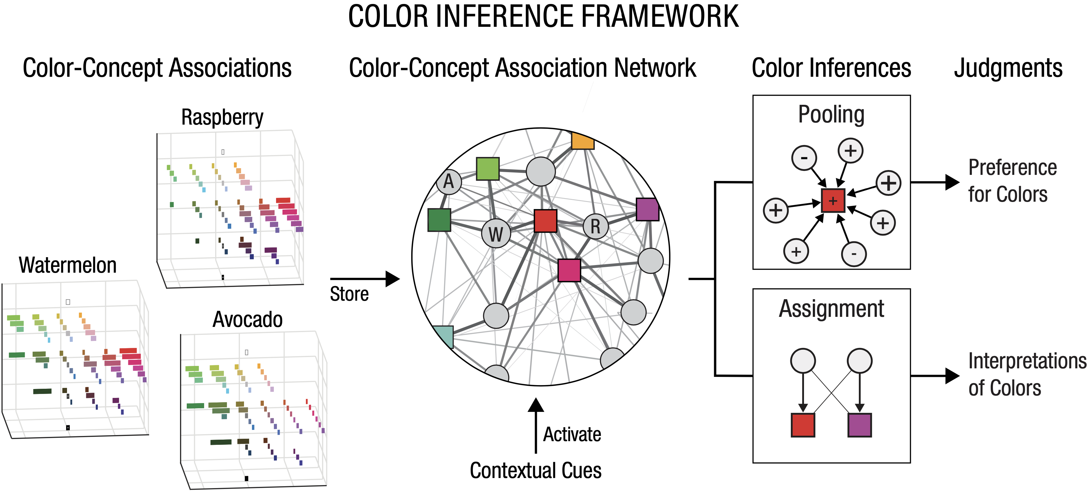
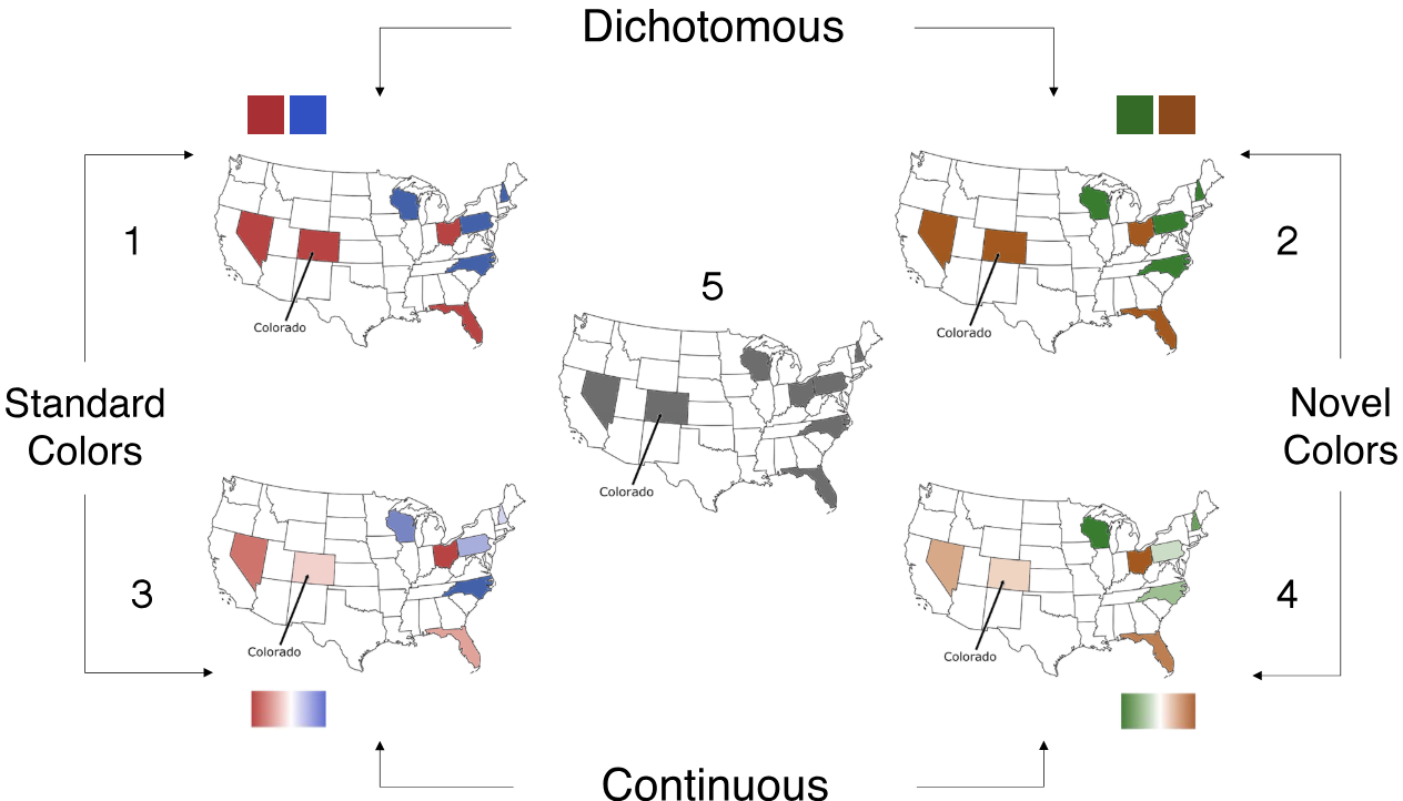 In the United States the color red has come to represent the Republican party, and blue the Democratic party, in maps of voting patterns. Here we test the hypothesis that voting maps dichotomized into red and blue states leads people to overestimate political polarization compared to maps in which states are represented with continuous gradations of color. We also tested whether any polarizing effect is due to partisan semantic associations with red and blue, or if alternative hues produce similar efects. In Study 1, participants estimated the hypothetical voting patterns of eight swing states on maps with dichotomous or continuous red/blue or orange/green color schemes. A continuous gradient mitigated the polarizing efects of red/blue maps on voting predictions. We also found that a novel hue pair, green/orange, decreased perceived polarization. Whether this efect was due to the novelty of the hues or the fact that the hues were not explicitly labeled “Democrat” and “Republican” was unclear. In Study 2, we explicitly assigned green/orange hues to the two parties. Participants viewed electoral maps depicting results from the 2020 presidential election and estimated the voting margins for a subset of states. We replicated the finding that continuous red/blue gradient reduced perceived polarization, but the novel hues did not reduce perceived polarization. Participants also expected their hypothetical vote to matter more when viewing maps with continuous color gradations. We conclude that the dichotomization of electoral maps (not the particular hues) increases perceived voting polarization and reduces a voter’s expected influence on election outcomes.
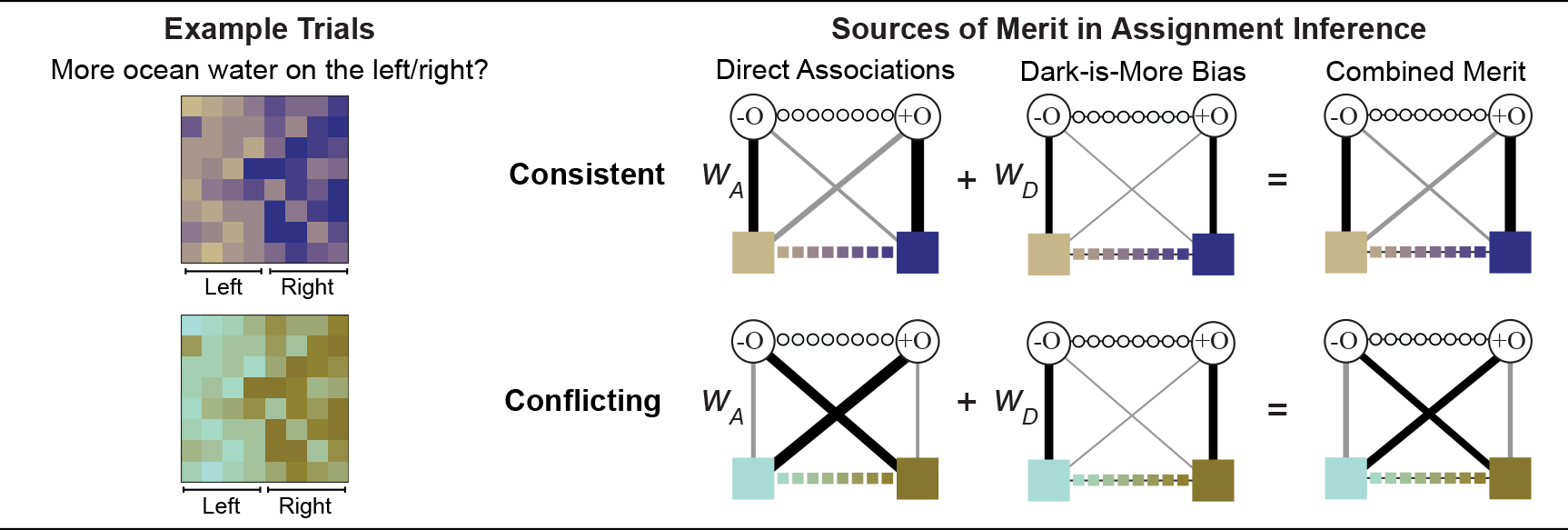 People have expectations about how colors map to concepts in visualizations, and they are better at interpreting visualizations that match their expectations. Traditionally, studies on these expectations (inferred mappings) distinguished distinct factors relevant for visualizations of categorical vs. continuous information. Studies on categorical information focused on direct associations (e.g., mangos are associated with yellows) whereas studies on continuous information focused on relational associations (e.g., darker colors map to larger quantities; dark-is-more bias). We unite these two areas within a single framework of assignment inference. Assignment inference is the process by which people infer mappings between perceptual features and concepts represented in encoding systems. Observers infer globally optimal assignments by maximizing the “merit,” or “goodness,” of each possible assignment. Previous work on assignment inference focused on visualizations of categorical information. We extend this approach to visualizations of continuous data by (a) broadening the notion of merit to include relational associations and (b) developing a method for combining multiple (sometimes conflicting) sources of merit to predict people’s inferred mappings. We developed and tested our model on data from experiments in which participants interpreted colormap data visualizations, representing fictitious data about environmental concepts (sunshine, shade, wild fire, ocean water, glacial ice). We found both direct and relational associations contribute independently to inferred mappings. These results can be used to optimize visualization design to facilitate visual communication
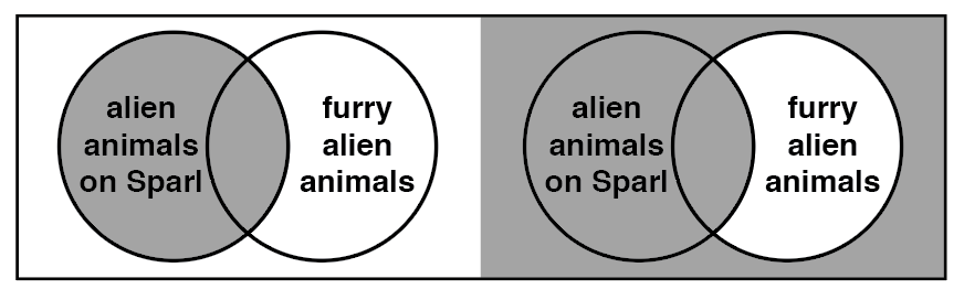 When interpreting the meanings of visual features in information visualizations, observers have expectations about how visual features map onto concepts (“inferred mappings”). In this study we examined whether aspects of inferred mappings, previously identified for other types of visualizations (e.g., colormap data visualizations), generalize to a different type of visualization, Venn diagrams. Venn diagrams offer an interesting test case because empirical evidence about the nature of inferred mappings for colormaps suggests that established conventions for Venn diagrams are counterintuitive. Venn diagrams represent classes using overlapping circles and express logical relationships between those classes by shading out regions to encode the concept of non-existence, or none. We propose that people do not simply expect shading to signify non-existence, but rather they expect regions that appear as holes to signify non-existence (the “hole hypothesis”). The appearance of a hole depends on perceptual properties in the diagram in relation to its background. Across three experiments, results supported the hole hypothesis, underscoring the importance of configural processing for interpreting the meanings of visual features in information visualizations.